
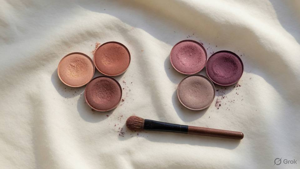
The outfit, the metal, the undertone
The outfit sets the temperature of the makeup before the first product is opened. A cool-toned outfit, such as a blue, grey, or silver saree, sits more comfortably with a cooler lip and a cooler blush, while a warm outfit, such as an orange, gold, or rust lehenga, sits with warmer tones. This is a direction, not a rule, and the skin's own undertone matters more than the fabric. The mistake is to match the makeup exactly to the outfit, which makes the face look like part of the dress. The aim is harmony: colours that belong to the same family without repeating each other word for word.
Jewellery gives a second clue. Gold jewellery usually flatters warm and olive skin, and silver usually flatters cool skin, but many Indian clients wear both and look well in both. Do not decide the undertone from the metal alone, because the metal may be a family piece rather than a choice. Instead, hold the jewellery near the face in daylight and see whether it makes the skin look clear or slightly grey. Then choose the highlight and the lip in the same direction. A warm gold highlight with silver jewellery can look out of place, and a silver highlight with heavy gold can look cold. The face is the centre; the jewellery should frame it, not fight it.
Deep colours need different treatment from pastels. A maroon, emerald, or navy outfit can carry a deeper lip and a stronger eye, because the colour of the clothes already gives the photograph weight. A pastel outfit usually looks better with a softer lip, a lighter blush, and a clean eye, because a strong face against a pale dress looks unbalanced. White and ivory are the most forgiving and the least interesting: they allow almost any makeup, but they also show every mark on the skin, so the base has to be even. Black is the opposite, because it flatters strong colour and makes a soft face look washed out.
The skin has to remain the reference point. A very fair client in a bright red outfit may look better with a softer red-brown lip than with a true red, while a deep-skinned client in the same outfit can carry a true red beautifully. A client with olive skin may find that a blue-based pink turns grey on her, while a warm rose looks natural. Test the lip and the blush against the fabric, not only against the face, because the photograph will show both together. If the combination looks like a costume, change the makeup rather than the outfit, since the outfit is usually the client's decision and the makeup is yours.
- 1. Ask to see the outfit, or a photograph of it, before choosing colours.
- 2. Note whether the outfit is warm, cool, or neutral in tone.
- 3. Look at the jewellery near the face in daylight.
- 4. Choose a lip and blush in the same temperature as the skin.
- 5. Keep deep outfits with deeper colour and pastels with softer colour.
- 6. Test the lip against the fabric as well as the face.
- 7. Avoid matching the makeup exactly to the outfit.
- 8. Photograph the finished face with the fabric in daylight.
Salon example
Aditi, twenty-eight, was a bridesmaid at a wedding where she would wear an emerald green saree with a gold border and gold jewellery. She had planned a blue-based pink lip because pink was her favourite, and she brought the saree to the trial. In daylight the pink turned slightly grey against the green, and the gold jewellery made it look colder still. We tried a warm rose and a soft terracotta instead. The rose looked pleasant, but the terracotta made her skin look clear and the green look richer. We kept the eye warm and simple with a bronze shadow and a small gold highlight on the cheekbone, and used a peach blush rather than pink. In the photographs the green is the main colour, the gold frames her face, and her makeup supports both without competing. She told me she would never have chosen terracotta in a shop, and now it is the shade she buys. At the wedding, two relatives asked for the name of the lipstick, and both were surprised that it was not pink. She now sends me a photograph of the outfit before every function, so that the colour conversation starts early.
Caution: Do not match a lipstick exactly to the outfit colour; an exact match flattens the face and makes the makeup look like part of the fabric.
One contrast, not five colours
A face reads best with one clear contrast. That contrast can be a deep lip against simple eyes, a strong eye against a nude lip, or a bright blush against a quiet face. When the eye, the lip, the blush, the highlight, and the outfit all compete, the viewer does not know where to look and the face loses its shape in the photograph. Choose the one feature that will carry the look, then keep the others in supporting roles. This is not a rule about restraint for its own sake; it is how the eye reads a face. One strong element is memorable, while five strong elements become noise.
Colour harmony gives you a few reliable structures. A monochrome look uses one colour family in different depths, such as a brown eye, a nude-brown lip, and a warm peach blush. An analogous look uses neighbouring colours, such as peach, coral, and warm rose. A complementary look uses opposite colours, such as a warm gold eye with a berry lip, or a green eye with a red lip, but in small amounts. These structures work because the colours relate to each other rather than competing. They also make it easier to choose a lip when the outfit is already strong, because the structure tells you what belongs and what does not.
Texture can carry variety without adding colour. A matte lip with a satin eye, a cream blush with a powder highlight, or a shimmery lid with a matte crease gives the face interest without introducing a new hue. Indian bridal makeup often uses gold as a texture rather than a colour: a gold shadow, a gold highlight, and gold jewellery can all read as one idea rather than three. If the client wants more than one colour, keep the second colour small and close to the first, such as a touch of bronze in the outer corner of a copper eye. A single unexpected colour, used in one place, looks deliberate; several unexpected colours look accidental.
The outfit and the jewellery count as colours in the composition, even though they are not on the face. A red lehenga with heavy gold jewellery is already two strong elements, so the face usually needs one more, not four. A pastel outfit with delicate jewellery leaves room for a stronger lip or a stronger eye, but not both. Look at the client from a step back with the fabric visible and ask yourself what the eye goes to first. If the answer is the lip, the eye should be quiet. If the answer is the jewellery, the makeup should support it. If the answer is nothing, add one contrast and stop.
- 1. Look at the whole client, including the outfit, before choosing colours.
- 2. Decide which single feature will carry the look.
- 3. Choose a structure: monochrome, analogous, or complementary.
- 4. Keep the supporting features quieter than the main one.
- 5. Use texture for variety before adding another colour.
- 6. Limit the face to two or three colour families in total.
- 7. Check the balance with the jewellery in the mirror.
- 8. Photograph the face and ask what the eye goes to first.
Salon example
Meenal, thirty, was a bride in a red lehenga with heavy gold jewellery and a red dupatta. Her family had suggested a blue liner to match a detail on the blouse, a green shadow because green was auspicious, and a bright pink blush for photographs. She arrived at the trial with four colours in mind and a photograph of a look that used all of them. We looked at the photograph together and agreed that the face was busy and the bride was hard to find. I suggested one contrast: a warm bronze eye with a soft gold highlight, a classic red lip close to the lehenga but slightly deeper, and a peach blush. The jewellery did the rest. In the trial photographs the red outfit, the gold jewellery, and the red lip made one warm picture, and her face was the centre of it. Her mother, who had wanted the green, admitted that the simpler version looked more expensive. The blue liner stayed in the drawer. Meenal has since sent me two friends who wanted the same problem solved, and both arrived with too many colours and left with one.
Caution: Do not add a second strong eye colour and a strong lip and heavy jewellery at the same time; the face disappears behind the makeup and the outfit.
Daylight, stage, and the camera between them
Colour changes with light, and makeup changes with it. Tungsten bulbs add yellow and red, so a cool pink lip can look warmer and a blue eye can look grey. Fluorescent tubes add green, which is unkind to olive skin and can make a warm blush look muddy. Modern LED lights vary enormously, from warm white to cool daylight, and a face that looks balanced under one can look orange under another. Daylight is the reference, but daylight also changes from morning to afternoon and from sun to cloud. The only reliable method is to look at the face in more than one light before the client leaves, and to photograph it in the light the event will use.
Stage light is stronger, more directional, and often coloured. A stage look needs more contrast than a daylight look because the light washes out subtle shading and the audience is far away. A lip that looks deep in the dressing room can look pale on stage, and a blush that looks strong can disappear. For stage, build the features with more definition and check from the back of the hall, not from the mirror. For a reception, the light is warmer and the distance is shorter, so the same strength looks heavy. If a client is performing and then attending a reception, plan two versions and keep the products to adjust between them.
The camera sits between the face and the viewer, and it changes colour again. A phone camera often boosts contrast and saturation, so a red lip can look brighter and a blush stronger than it did in the mirror. A professional camera with a flash can wash out colour and flatten the face, which is why a makeup that looks strong in person can look pale in a photograph. A camera in low light adds noise and shifts colour, especially on deep skin. Test with the device that will actually be used if you can, and if you cannot, test with a phone at the distance the photographs will be taken. Then choose a middle ground that works in the room and in the picture.
The practical routine is simple. Finish the makeup, look at the face in daylight, then under a warm bulb, then with a phone flash. Compare the lip with the outfit and the blush with the neck. If the face looks good in all three, it will usually look good at the event. If it looks good in one and wrong in another, the wrong one tells you which product to adjust. Do not judge colour under a ring light alone, because a ring light is designed to flatter and it hides the shifts that daylight and flash will reveal. The client will live in the event light, not in the salon, and the makeup should be built for where she is going.
- 1. Finish the makeup before judging any colour.
- 2. Look at the face in daylight near a window.
- 3. Look again under a warm bulb.
- 4. Photograph with a phone flash at the event distance.
- 5. Compare the lip with the outfit in each light.
- 6. Compare the blush with the neck in each light.
- 7. Adjust the one product that looks wrong, not the whole face.
- 8. Do not judge colour under a ring light alone.
Salon example
Sara, twenty-six, had a daytime wedding at noon and a reception at seven in the same hotel. She wanted one face for both, which is a common request and rarely the best plan. At the trial we finished the makeup at two in the afternoon and looked at it in daylight. The lip was a warm coral and the blush was soft, and both looked fresh. Under the warm bulbs of the reception hall the coral turned slightly orange and the blush almost disappeared, while her gold jewellery looked richer. With a phone flash the coral went bright and the blush came back. We decided to keep the daytime version for the ceremony and change only the lip for the evening, to a deeper rose that held its colour under warm light. The change took two minutes and one product. At the reception the photographs show a face that belongs with the jewellery and the lights, and the daytime pictures show a face that belongs with the sun. One product, two events. Sara kept the daytime lip in her bag and wore it the next morning, which is the simplest test of whether a colour belongs to a face.
Caution: Do not judge a colour under a ring light or a warm salon bulb alone; both flatter the face and hide the shifts that daylight and camera flash will show.
This is a Nandu Nai textbook. It is a private brand book, not a government licence, and it does not give the right to give medical treatment.